
AI-Powered Text Response Analysis for Open-Ended Survey Questions
Introduction
Open-ended questions are commonly used in surveys, particularly when the goal is to explore a subject in depth or gather qualitative insights in unfamiliar areas. While they are powerful tools for obtaining nuanced feedback, analyzing open-ended responses at scale can be challenging. The variety of responses often necessitates manual coding or thematic grouping, which can be time-consuming and error-prone, especially with thousands of entries.
This is where Artificial Intelligence (AI), specifically Large Language Models (LLMs), can play a transformative role. Leveraging advanced AI techniques, data scientists can automate much of the analysis of open-ended responses, producing quantitative insights from qualitative data. In this blog, I’ll showcase how AI can be applied to enhance the analysis of text responses from open-ended questions by walking through a project example.
This article is structured as follows:
- Project Description: Background and goals of the project.
- Methodology: The AI-driven approach, including data generation, cleaning, analysis (sentiment and classification), and visualization.
- Conclusion: A summary of the AI-powered analysis process, along with limitations and potential improvements.
1. Project Description
ApexCDS, a global high-tech company, recruits over 10,000 new employees annually. To improve the onboarding process, the company administers a survey to gather feedback from these employees. One of the key questions in this survey is an open-ended question: "What could have been better about the orientation experience?" The sheer volume of responses makes it difficult for human analysts to extract useful insights in a timely manner.
The company's goal is to use AI to convert these qualitative responses into quantitative data that can be easily digested by executives. With AI, ApexCDS aims to identify actionable themes and sentiments from the feedback, allowing decision-makers to prioritize improvements to the onboarding process.
2. Methodology
2.1. Dataset Overview
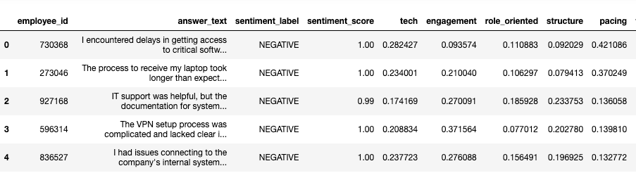
The dataset used in this analysis is pulled directly from the company’s database, containing two essential fields: employee_id and answer_text. Each record represents an employee's response, with both the employee ID and answers generated by AI to maintain anonymity and confidentiality.
The responses are diverse, ranging from simple, one-word answers like "nothing" to detailed paragraphs. Our task is to transform this unstructured text into meaningful insights. Here's a sample of how the dataset looks:
Dataset Sample:
| employee_id | answer_text |
|---|---|
| 730368 | I encountered delays in getting access to critical software tools, which affected my ability to get started quickly |
| 273046 | The process to receive my laptop took longer than expected, causing delays in my workflow |
| 927168 | IT support was helpful, but the documentation for system setup could be improved. |
| ... | ... |
2.2. Data Cleansing
The first challenge is dealing with the messiness of real-world data. Open-ended responses often contain duplicates or irrelevant responses like "N/A" or "nothing." These need to be removed to prevent them from skewing the analysis. Additionally, overly positive answers, like "everything is fine," might not contribute much to identifying areas for improvement and can also be excluded.
We used basic text preprocessing techniques such as:
- Removing duplicates
- Eliminating meaningless answers (e.g., "N/A," "Nothing.")
- Filtering out overly positive feedback that doesn’t suggest room for improvement (after sentiment analysis).
At the end of this process, we are left with a cleaner, more focused dataset that’s ready for analysis.
# remove duplicated responses generated by ChatGPT
df = df.drop_duplicates(subset=['answer_text'])

# Remove rows with non-informative answers using regex
df = df[~df['answer_text'].str.contains(r'(?i)\b(na|n/a|none|nothing|so far so good)\b', regex=True)]
2.3. Conducting Sentiment and Classification Analysis Using AI Tools
Sentiment Analysis:
We used the pipeline in HuggingFace transformers module to perform sentiment analysis on the responses. This step helps identify whether the feedback is positive or negative. For example, a response like "So far so good" would be marked as 'POSITIVE'. Since our focus is on identifying areas for improvement, we will filter out the positive responses after conducting the sentiment analysis.
from transformers import pipeline
# pick model for sentiment analysis
sentiment_classifier = pipeline("sentiment-analysis")
Apply the sentiment classifier function across the whole dataset:
def extract_sentiment(text):
    # Ensure text is a valid string before applying sentiment_classifier
    if isinstance(text, str) and text.strip():  # Check if the text is a non-empty string
        result = sentiment_classifier(text)[0]
        label = result['label']
        score = round(float(result['score']), 2)
    else:
        label = 'UNKNOWN'
        score = 0.00
    return pd.Series([label, score])

# Apply the function to the dataframe and create two new columns
df[['sentiment_label', 'sentiment_score']] = df['answer_text'].apply(extract_sentiment)
Classification Analysis:
Next, we applied AI models to classify the responses into predefined categories. Based on previous analysis and consultation with stakeholders, we narrowed the categories down to five major themes:
- Tech Setup Delays
- Engagement and Interactivity
- Clarity on Role and Company Culture
- Structure and Organization
- Pacing and Duration
Each response is assigned a score for these themes using a pre-trained language model fine-tuned for this task. The model assigns probabilities for each category, which has been normalized to ensure that the total score across all themes for each response sums up to 1. This allows for meaningful comparisons between different categories.
# pick model for classification
zeroshot_classifier = pipeline("zero-shot-classification", model = "facebook/bart-large-mnli")

# Define the labels for zero-shot classification
labels = ['Tech Setup Delays', 'Engagement and Interactivity', 'Clarity on Role and Company Culture', 'Structure and Organization', 'Pacing and Duration']

# Initialize the zero-shot classification pipeline (Hugging Face)
zeroshot_classifier = pipeline("zero-shot-classification", model="facebook/bart-large-mnli")

# Function to extract theme scores for each label
def extract_theme(text):
    if isinstance(text, str) and text.strip():  # Check if the text is a non-empty string
        result = zeroshot_classifier(text, candidate_labels=labels)
        # result contains 'labels' and 'scores', we map them together
        scores = dict(zip(result['labels'], result['scores']))

        tech = scores.get('Tech Setup Delays', 0.00)
        engagement = scores.get('Engagement and Interactivity', 0.00)
        role_oriented = scores.get('Clarity on Role and Company Culture', 0.00)
        structure = scores.get('Structure and Organization', 0.00)
        pacing = scores.get('Pacing and Duration', 0.00)
    else:
        tech = 0.00
        engagement = 0.00
        role_oriented = 0.00
        structure = 0.00
        pacing = 0.00

    return pd.Series([tech, engagement, role_oriented, structure, pacing])

# Apply the function to the dataframe and create new columns
df[['tech', 'engagement', 'role_oriented', 'structure', 'pacing']] = df['answer_text'].apply(extract_theme)
The classification process enables us to convert qualitative feedback into quantitative scores, making it easier to identify which areas need the most attention.
The dataframe now includes sentiment analysis results and classification scores, as shown below:
2.4. Data Analysis
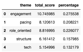
With the results from the classification model, the next step is to quantify the importance of each theme. We aggregate the total score for each theme across all responses and calculate normalized scores. These normalized scores provide a clear, comparable metric for determining the relative weight of each issue in the feedback.
For example, if the theme "Tech Setup Delays" has a normalized score of 0.35, it means that 35% of the negative feedback is related to delays in technical setup during orientation.
# Melt the dataframe to unpivot the theme columns into a single 'theme' column
df_melted = df.melt(id_vars=['employee_id', 'total_score'],
                    value_vars=['tech', 'engagement', 'role_oriented', 'structure', 'pacing'],
                    var_name='theme',
                    value_name='theme_score')

# Group by theme and sum the scores to get the total score for each theme
df_new = df_melted.groupby('theme').agg({'theme_score': 'sum'}).reset_index()

# Rename 'theme_score' to 'total_score' for the final output
df_new.rename(columns={'theme_score': 'total_score'}, inplace=True)

# Normalize the scores
df_new['percentage'] = df_new.total_score/df_new.total_score.sum()

# Desplay the df_new dataframe
2.5. Data Visualization
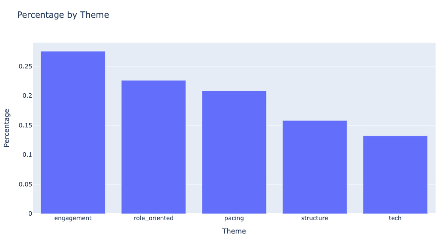
Visualization is a crucial part of the analysis, as it helps stakeholders quickly grasp the insights. We chose to use the Python library Plotly for its interactive and visually appealing charts.
A simple bar chart can display the scores for each theme in descending order. This shows stakeholders which areas contribute the most to the negative sentiment in the feedback.
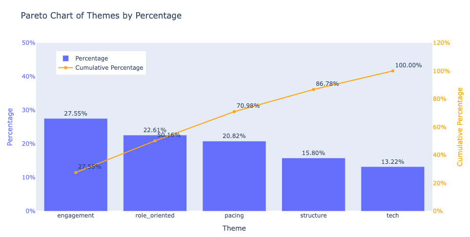
Additionally, we created a Pareto chart to demonstrate the cumulative impact of the top issues. In a Pareto chart, the first few themes often account for a significant proportion of the total score, following the 80/20 rule. This helps executives focus on the key areas that will yield the most improvement with targeted efforts.
2.6. Insight and Actionable Suggestions
The analysis reveals that four key improvement areas—engagement, role_oriented, structure, and pacing—account for over 85% of the issues mentioned in the responses. These areas map back to the original themes identified. Below are actionable suggestions for each theme:
-
Engagement and Interactivity: Respondents suggested that the sessions lacked engagement and would benefit from more interactive activities.
Actionable Suggestion: Introduce interactive elements like Q&A sessions, group discussions, or hands-on activities to keep participants actively involved and foster a better learning experience. -
Clarity on Role and Company Culture: There were requests for more clarity on the new hire's role, career path, and a deeper discussion of company culture and values.
Actionable Suggestion: Incorporate specific sessions dedicated to explaining role expectations, career development opportunities, and the company’s core values and culture. -
Structure and Organization: Feedback indicated that the orientation felt disorganized or lacked a clear structure.
Actionable Suggestion: Implement a structured agenda for each orientation session, ensuring a logical flow of topics with clear objectives. -
Pacing and Duration: Many respondents commented that the orientation sessions were too long or moved too slowly.
Actionable Suggestion: Break the orientation into shorter, more interactive sessions to maintain engagement without overwhelming new hires.
3. Conclusion
Our analysis shows that AI can significantly streamline the analysis of open-ended survey responses. By automating sentiment and classification tasks, we were able to transform thousands of free-text responses into structured, actionable insights. This allows for quicker decision-making and more targeted interventions.
However, it’s important to recognize the limitations of AI-powered analysis. Security and privacy concerns may restrict the use of certain AI tools in corporate environments. Moreover, as new models and techniques are continuously being developed, there is always room for improvement. Fine-tuning models for specific use cases and incorporating advanced techniques such as transformer-based models (e.g., BERT, GPT) could enhance the accuracy and depth of the analysis.
In conclusion, while AI has proven to be a valuable tool in the analysis of text responses, there is still potential for further refinement. With continued advancements in AI, we can expect even more efficient and insightful analyses of qualitative data in the near future. Open-ended questions, once viewed as too complex to analyze at scale, may become increasingly common in surveys, thanks to AI.
Appendix
Visualization codes:
- Bar Chart
# Set 'notebook' as default canvas
import plotly.io as pio
pio.renderers.default = 'notebook'

# Sort dataframe by percentage value
df_sorted = df_new.sort_values(by='percentage', ascending=False)

import plotly.express as px

# Create the bar chart using Plotly
fig = px.bar(df_sorted, x='theme', y='percentage', title='Percentage by Theme', labels={'percentage': 'Percentage', 'theme': 'Theme'})

# Show the plot
fig.show()
- Pareto Chart
import plotly.graph_objects as go

# Calculate the cumulative percentage
df_sorted['cumulative_percentage'] = df_sorted['percentage'].cumsum()

# Create the bar chart
fig = go.Figure()

# Add the bars for the percentage
fig.add_trace(go.Bar(
    x=df_sorted['theme'],
    y=df_sorted['percentage'],
    name='Percentage',
    marker_color='#636EFA',
    yaxis='y1',
    text=[f'{p*100:.2f}%' for p in df_sorted['percentage']],  # Add values on top of bars
    textposition='outside'
))

# Add the line for the cumulative percentage
fig.add_trace(go.Scatter(
    x=df_sorted['theme'],
    y=df_sorted['cumulative_percentage'],
    name='Cumulative Percentage',
    mode='lines+markers+text',
    line=dict(color='orange', width=2),
    yaxis='y2',
    text=[f'{cp*100:.2f}%' for cp in df_sorted['cumulative_percentage']],  # Add values on points
    textposition='top right'
))

# Update the layout for better visualization with two y-axes
fig.update_layout(
    title='Pareto Chart of Themes by Percentage',
    xaxis=dict(title='Theme'),
    yaxis=dict(
        title='Percentage',
        range=[0, 0.5],  # 0 to 30% for percentage
        tickformat='.0%',
        titlefont=dict(color='#636EFA'),
        tickfont=dict(color='#636EFA'),
        showgrid=False
    ),
    yaxis2=dict(
        title='Cumulative Percentage',
        overlaying='y',
        side='right',
        range=[0, 1.2],  # 0 to 100% for cumulative percentage
        tickformat='.0%',
        titlefont=dict(color='orange'),
        tickfont=dict(color='orange'),
        showgrid=False
    ),
    showlegend=True,
    legend=dict(
        x=0.05,  # Move the legend to the left
        y=0.95,  # Move the legend to the top
        xanchor='left',  # Anchor the legend to the left
        yanchor='top',   # Anchor the legend to the top
    )
)

# Show the plot
fig.show()